
Diese Seite gibt es auch auf Deutsch.
Think accessible!
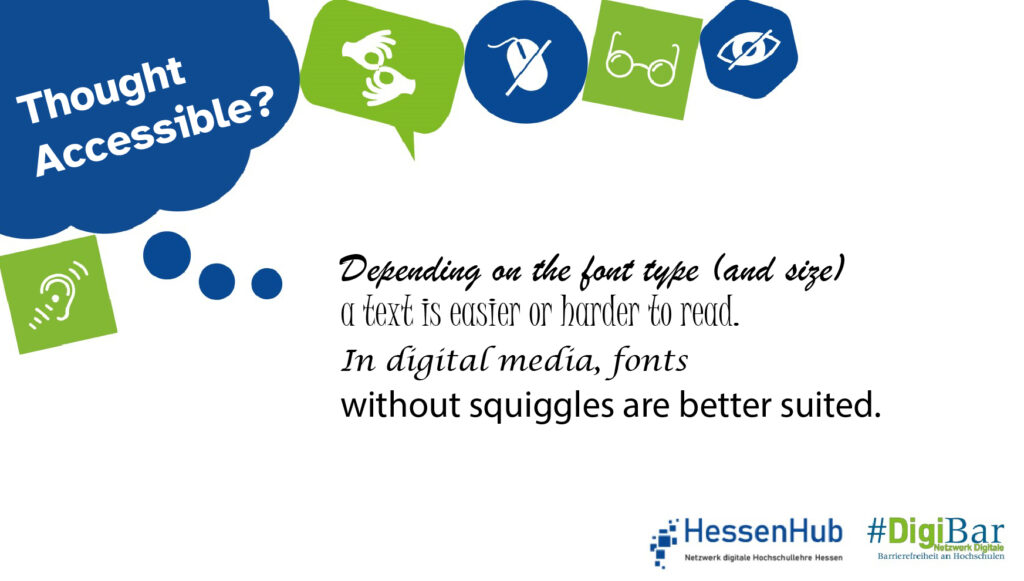
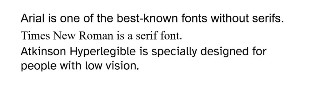
The short lines at the ends of letters are called serifs. In general, for people with visual impairments, sans serif fonts are easier to read than fonts with serifs. Accessibility therefore starts with choice of the font. In addition to serifs, factors such as font width and stroke width determine how well or poorly people with and without visual impairments can read text.
Further information.
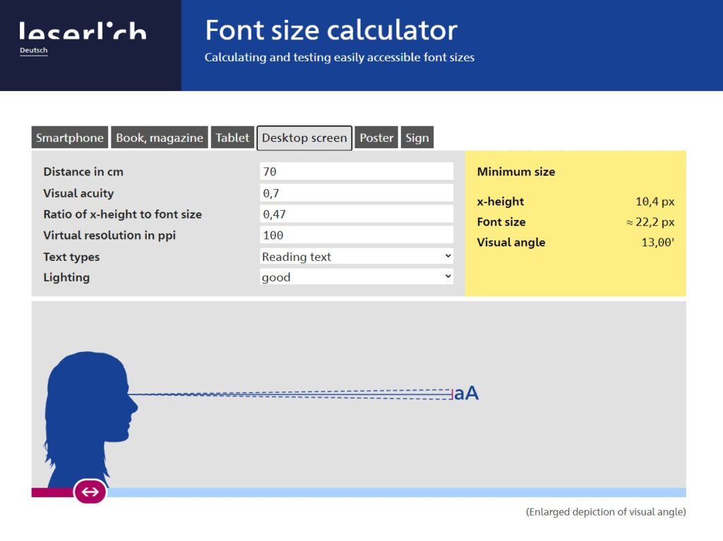
The German Association for the Blind and Visually Impaired (DBSV) summarises the requirements for a legible and readable font on its website leserlich.info. The DBSV offers a font size calculator and a contrast calculator, as well as detailed explanations of characters and texts.
The font Atkinson Hyperlegible, for example, was developed specifically for visually impaired people. The shape of each character is designed to be easily distinguishable, making it easy to recognise and read even for the visually impaired.
In a university or corporate environment, media designers cannot necessarily decide for themselves which fonts to use in their products: Corporate design dictates which fonts should be used in which media. Ideally, accessibility has already been taken into account in the development of these specifications.
Responsible for the content: WG „Digital Accessibility Campaign“.
Do you have any questions or suggestions? Please contact Sanja Grimminger.
#DenkBarrierefrei #ThinkAccessible #DigiBar #HessenHub #AnAllesGedacht