Diese Seite gibt es auch auf Deutsch.
Think Accessible!
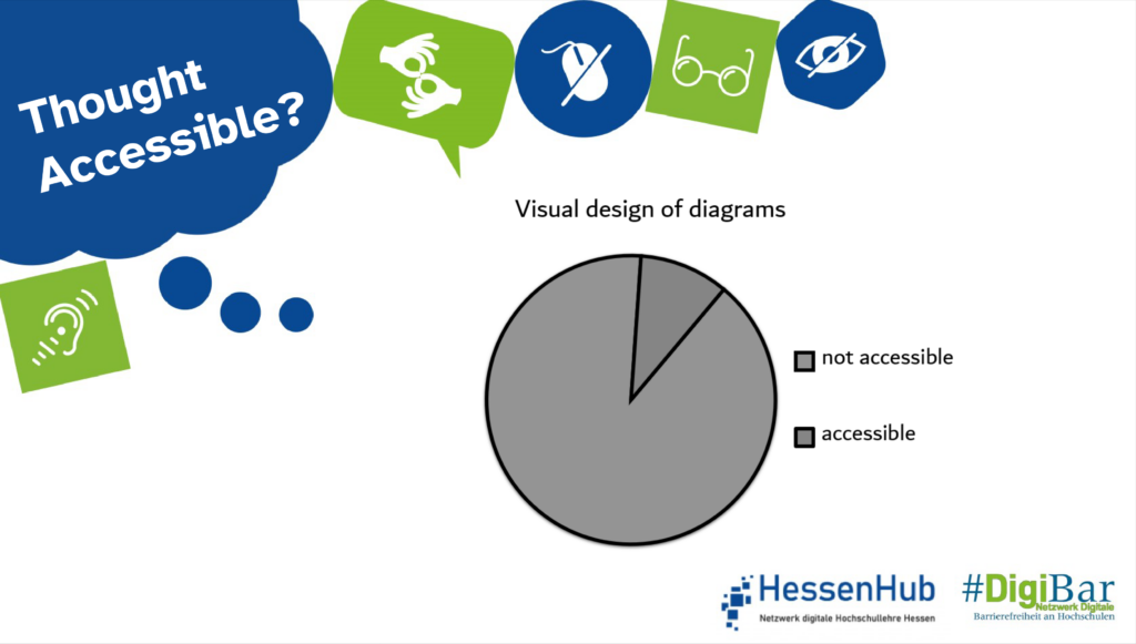
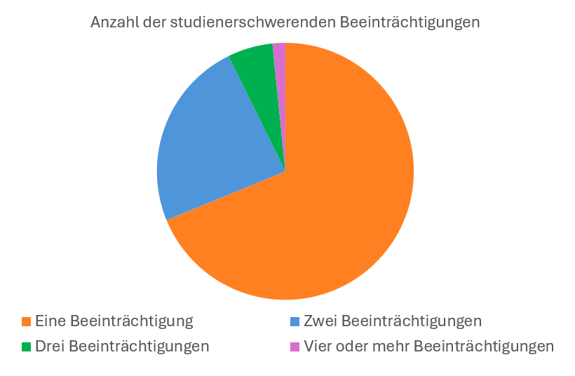
Charts can contain many hidden barriers that limit accessibility for different groups of people. Insufficient contrast, missing or unclear labels, and too small fonts can make information harder to perceive. Using colour as the only distinguishing feature can reduce comprehension for people with colour vision deficiencies. Missing alternative texts can also create barriers, as screen readers users don’t receive descriptions of the graphs. Those issues can often be resolved through simple adjustments.
Further information.
To convey information in diagrams without barriers, the following points must be observed.
Defining Information
First, important information has to be identified. Unnecessary information should be left out to maintain clarity and avoid overwhelming the reader with too much information.
Adjust Colours
A minimum contrast ratio of 3:1 between foreground and background areas should be maintained. This means that colours must be chosen in a way that the foreground is at least three times lighter or darker than the background. Allowing users to adjust colour settings individually can increase accessibility. A corporate design can guide the choice of colours – assuming accessibility guidelines are followed.
A helpful tool for selecting accessible colours is the Viridis Color Palette Generator. Based on the number of required colours, the tool suggests a range of accessible palettes.
Further information on colour selection and contrast can be found in the An Alle(s) gedacht?-article „Kontraste”.
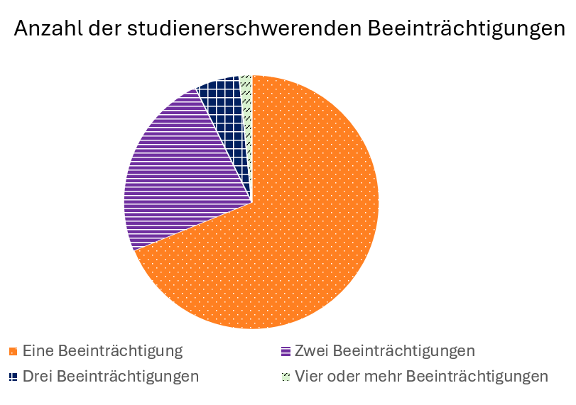
Adding Patterns
To ensure that different areas within the diagram are clearly distinguishable, dividing lines can be added. In addition to colours, shapes and textures can also be applied. For example areas can be hatched, checkered, or dotted. This avoids relying solely on colours and allows a distinction without or limited colours perception. This also helps if the diagram is printed out in black and white. Further information on this topic can be found in the An Alle(s) gedacht?- article “Farbsehschwäche”.
Adding Labels
Charts can be enhanced with direct labeling. Labels are placed immediately next to the relevant data points or areas. This eliminates the need for readers to constantly shift their attention between the chart and a separate legend.
Using Alt Texts
Alternative texts are essential for ensuring the accessibility of graphics and charts. When there are only a few data points, alt texts should communicate the most important figures and facts. For trends or patterns, the description should focus on the main message or relationships. It is important to include only the most relevant information to avoid overloading the alt text. More information can be found in the An Alle(s) gedacht?- article “Alternativtexte”.
Providing Additional Data Tables
An additional data table can make it easier for some users to access and understand the information, as it presents the content in a different, often more structured format.
Checking for Accessibility
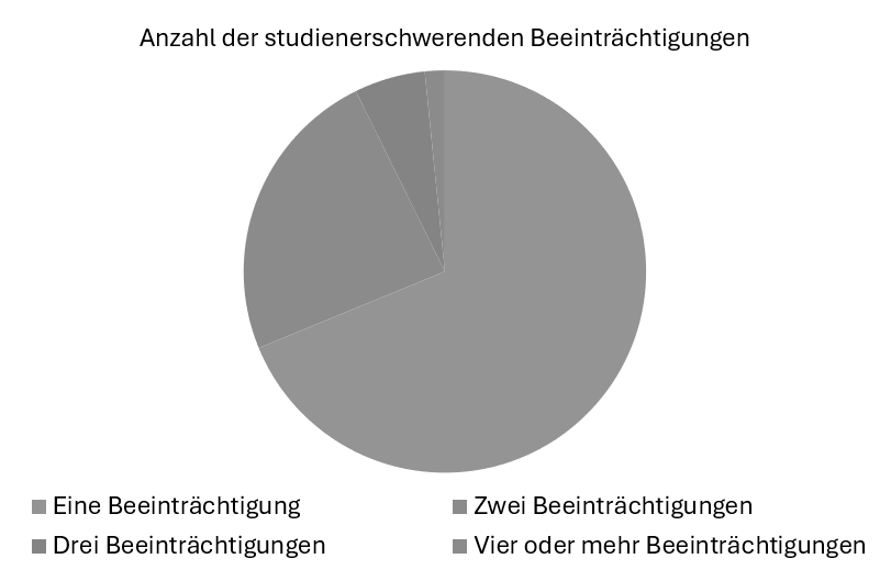
Before publishing a chart, it should be tested for accessibility. A black-and-white view or a colour vision deficiency simulator can help determine whether the content remains distinguishable without or with limited colour perception.
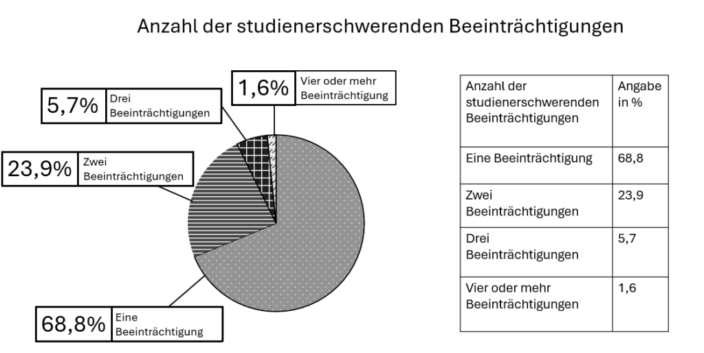
More accessibility through patterns, labelling and data tables
More accessible chart
Sources
- Barrierefreie Diagramme – stolperfrei.digital
- Barrierefreie Grafiken – FernUniversität in Hagen
- Zugängliche statistische Grafiken / Diagramme | ETH Zürich
Responsible for the content: WG “Digital Accessibility Campaign”.
Do you have any questions or suggestions? Please contact Sanja Grimminger.
#DenkBarrierefrei #ThinkAccessible #DigiBar #HessenHub #AnAllesGedacht