Diese Seite gibt es auch auf Deutsch.
Think Accessible!
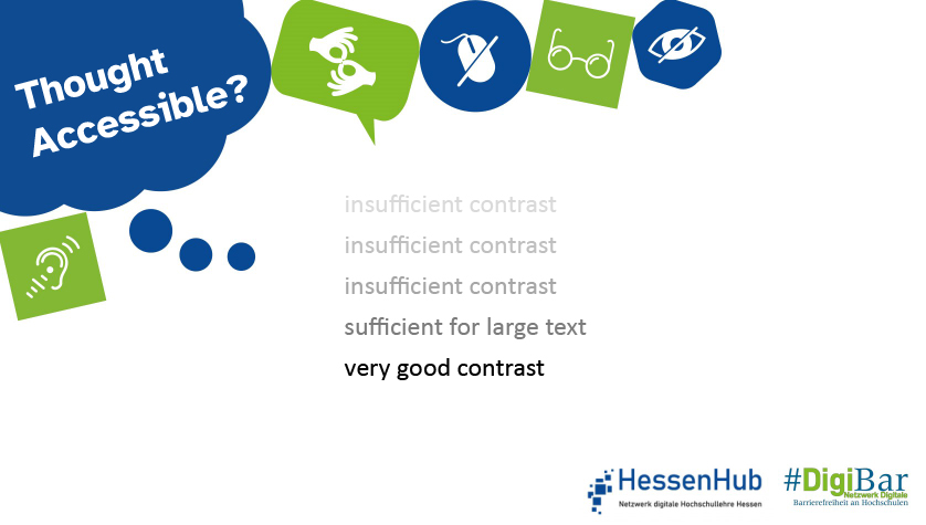
The contrast between the foreground and background colours should be high enough for everyone to see the content. Sufficient contrast in text is not only important for people with visual impairments. In general, it prevents reading fatigue and ensures good readability, for example when the sun is shining on the desktop.
Further information.
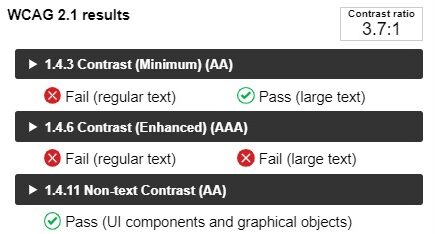
The international standard WCAG. 2.1 (Web Content Accessibility Guidelines) specifies when contrast is sufficient. This can be checked with tools such as the Colour Contrast Analyser (CCA), which can be downloaded free of charge. The #DigiBar website has a screencast guide to the CCA.
The tool provides a variety of results. It distinguishes between normal and large text and graphics, and also between levels of conformance (AA = minimum contrast; AAA = increased contrast).
Responsible for the content: WG „Digital Accessibility Campaign“.
Do you have any questions or suggestions? Please contact Sanja Grimminger.
#DenkBarrierefrei #ThinkAccessible #DigiBar #HessenHub #AnAllesGedacht