
Diese Seite gibt es auch auf Deutsch.
Think Accessible!
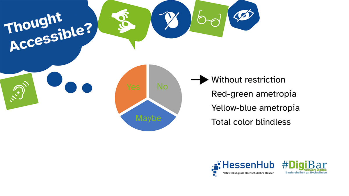
Were you able to grasp the graphics without effort, or would you rather have paused the content to have more time? And were you always able to decipher the font well? It’s not just moving images that can present barriers, but also the choice of font and background color. Colors should therefore not be used as the sole means of distinguishing or highlighting aspects of the content.
Further information.
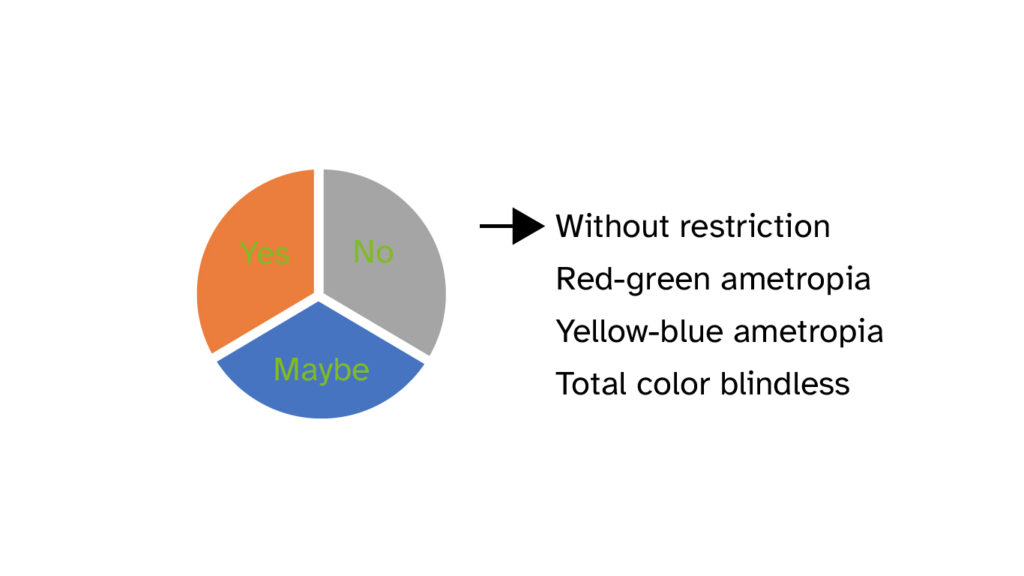
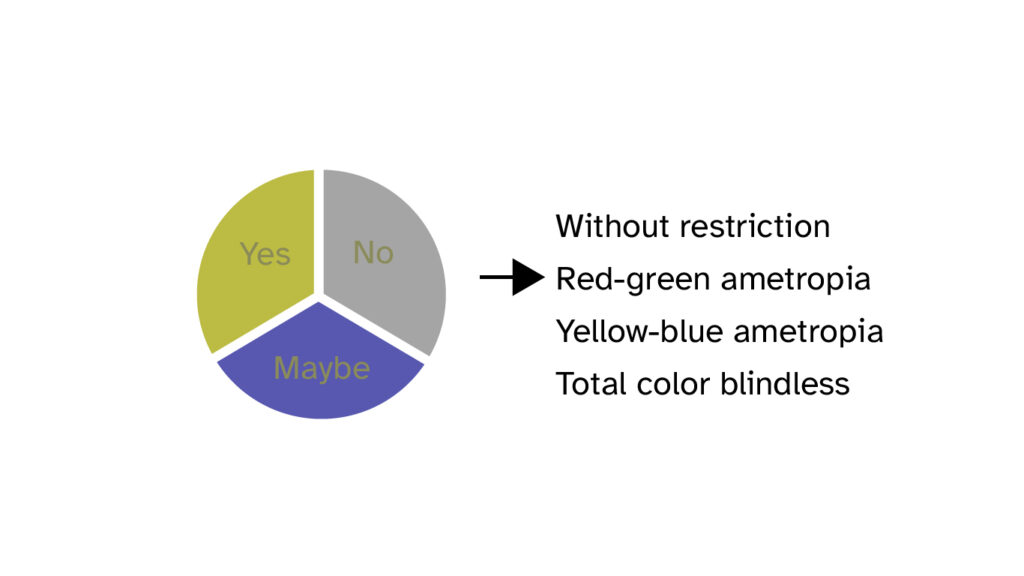
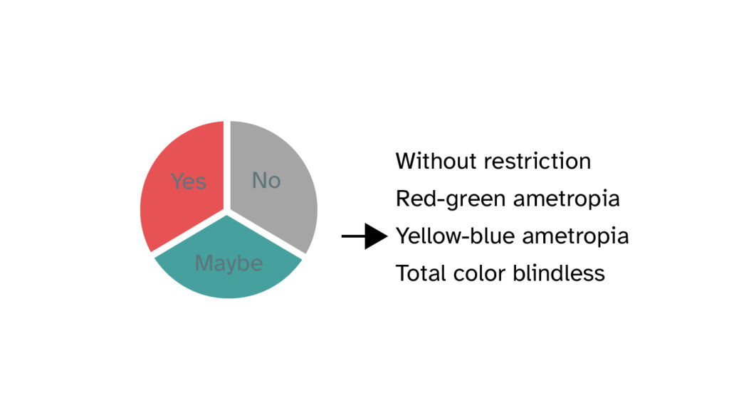
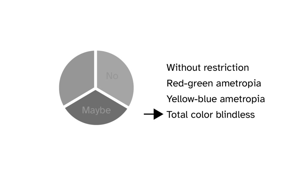
The most common form of color vision deficiency is red-green vision deficiency. It occurs in about 9% of men and 0.8% of women (source: Kuratorium Gutes Sehen e. V.). The Web Disability Simulator shows what color vision deficiencies can look like for those affected. This can be installed in Chromium-based browsers (such as Brave, Google Chrome, Microsoft Edge, and Opera). In Mozilla Firefox, the web developer tools have an accessibility section that can be used to simulate different visual impairments.
Whether the contrast between foreground and background color is strong enough can be tested with tools like Colour Contrast Analyzer (CCA). A tutorial for the CCA can be found as a screencast at #DigiBar.
Regarding moving images, the WCAG 2.2 (Web Content Accessibility Guidelines) specifications include, on the one hand, that there should be the option to pause the medium and, on the other hand, that there should be an equivalent alternative to ensure accessibility to the content (e.g., through an alternative text, subtitles, audio description, or similar).
Therefore, at this point we display the images used in the GIF as individual graphics.
Responsible for the content: WG „Digital Accessibility Campaign“.
Do you have any questions or suggestions? Please contact Sanja Grimminger.
#DenkBarrierefrei #ThinkAccessible #DigiBar #HessenHub #AnAllesGedacht